

👋 Hi, I'm Libby. I help rising leaders and executives communicate with clarity and confidence. Each month I share frameworks and real talk on presentation skills, storytelling, and executive presence. For more: The Slide Master | The Presentation Lab | LinkedIn.
Text-heavy slides are universally hated. But here's the uncomfortable truth: when you pack your slides with text, you're not making your message clearer. You're making it less clear. The fix isn't a redesign cosmetic change. It's understanding why text fails and knowing exactly which visual format works for each type of slide.
Why Your Audience Can't Do Both
Here's the science: your brain processes visual information much faster than text. But when you fill your slides with text, you've created an impossible choice for your audience. They can either read your slides or listen to you. Not both simultaneously.
By filling your slides with text, you've created your own competition for attention. You've given your audience two separate streams of information and asked them to focus on both. It's like trying to watch a movie and listen to a podcast at the same time. Your audience will always pick one, and when they do, they stop hearing you.
The core principle is simple: your slides tell the visual story. You tell the verbal story. They complement each other. They don't duplicate each other.

The Three Slide Types That Need Visual Fixes
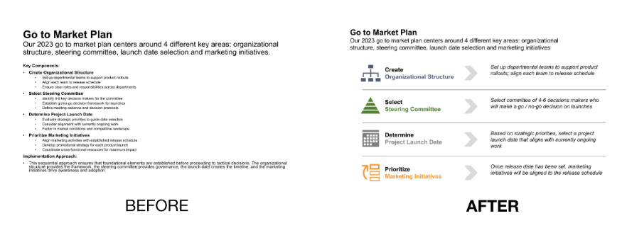
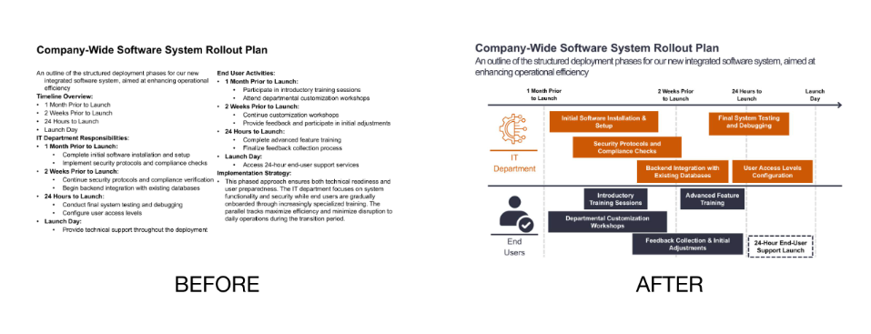
The problem: bulleted lists of dates or steps force your audience to mentally construct the sequence or relationship between elements themselves.
The fix: use visual representations that show progression, connection, and flow at a glance. Your audience grasps the sequence or relationship much faster with a visual representation than with bullets they have to interpret.
When to use this: project histories, strategic roadmaps, company milestones, procedures, systems, cyclical workflows, or any sequence with interconnected steps.
How to create it: PowerPoint's SmartArt is your friend. Look under "Process" or "Cycle" categories for ready-made options. For timelines, choose horizontal layouts with chevrons or milestones. For process flows, arrange shapes and connecting arrows to show relationships. Use color strategically to highlight current phases or critical steps. Limit each visual to 4-7 elements. If your process is more complex, break it into phases. Take advantage of both horizontal and vertical space on your slide.
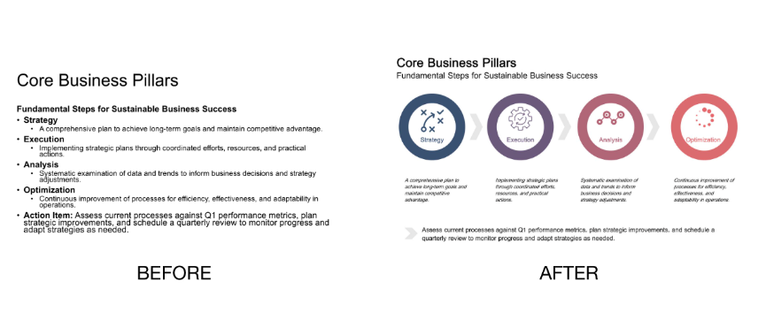
Bullet-Centric and Text-Filled Slides
The problem: a wall of text with lots of bullet points overwhelms your audience and dilutes your key message.
The fix: create a visual layout that highlights your main points with strategic use of space, icons, and formatting. Keep only the most essential text.
How to create it: break your content into clear sections with visual hierarchy. Use icons, diagrams, or simple shapes to represent concepts. Convert paragraphs into brief phrases. Anything detailed goes in your speaker notes or appendix. The slide itself should be instantly digestible.
Concept and Framework Slides
The problem: dense paragraphs explaining abstract concepts with no visual organization make it difficult for your audience to see relationships and hierarchies.
The fix: use a clear diagram with shapes, minimal text, and thoughtful layout to instantly communicate how components relate to each other.
When to use this: explaining models, organizational structures, processes, or any conceptual relationships that benefit from visual representation rather than text description.
How to create it: start with basic shapes and connection lines. PowerPoint's SmartArt offers several conceptual layouts under "Relationship" and "Hierarchy" categories. Use consistent colors to group related concepts. Consider using size to indicate importance or hierarchy.
Make Your Visuals Stick
Pass the 3-second test. Any visual should be understood within 3 seconds. If it takes longer, simplify. Remember that your audience is seeing these slides for the first time while you're the one who has been staring at them for days.
Use descriptive slide titles. Your title should convey the key takeaway, not just the topic. "Revenue Increased 23% After Product Launch" tells your audience the story. "Financial Results" tells them nothing until they read the rest of the slide.
Be consistent throughout. Use the same colors, fonts, and visual styles. This trains your audience's eye and makes your message stronger.
Animate strategically. Use simple "appear" animations to control the flow of information and prevent your audience from reading ahead.
The Shift That Changes Everything
Converting text-heavy slides to visual slides isn't about being a better designer. It's about respecting your audience's cognitive load. You do the hard work of figuring out what your slide is about and how to show it visually. Your audience gets to focus on listening to you instead of decoding your slides.
Start with the three slide types above. Identify which ones show up in your next presentation. Then apply the visual fix. Your audience will follow you better. Your message will land clearer. And you'll stop competing with your own slides.
Enjoyed this? Get more like it.
Join The Presentation Lab for frameworks, templates, and coaching to help you present like a leader. New posts land here every month.
